This article is part of the series 25 building blocks to create better streets, neighbourhoods, and cities. Read how design, departing from the human dimension contributes to the quality of the urban environment. Follow the link below to find an overview of all articles.
Human dimension means that residents nor visitors feel overwhelmed by the environment. An urban planner must avoid them thinking that it is all about other things, such as commerce, traffic, or the buildings themselves, which unfortunately often is the case indeed. Constructions by 'star architects' can be crowd pullers but usually also result into a disproportionate use of space. Cities therefore better tolerate only a limited number of such edifices. Alexander Herrebout (OTO Landscape) believes that space has a human dimension if you experience attention for you as a human being and that there are objects you can connect with. For many, this will be more often a historic building (church, town hall) than a modernist one.
Compactness (‘enclosure’)
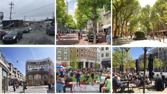
Compact streets and squares give a sense of security. They encourage people to linger there, increasing the chance of unforeseen encounters. Sjoerd Soeters considers squares in the first place as a widening in the street pattern and therefore they are preferably no larger than 24 by 40 meters. A round or oval shape enhances the feeling of security. If the height of the surrounding buildings is also in line with this, there may be contact between residents and people on the street. Good examples are the square he designed in the Oostpoort shopping center in Amsterdam, but also a square in <em>The Point</em>, a new shopping center in Utah (US), resp. bottom left and bottom center and of course the Piazza der Campo in Siena.
If streets are too wide or narrow or buildings are too high?
Trees, for example a double row all around, will help if a street is too wide or a square is too big. Trees are also a source of reducing urban heat. The extent to which trees contribute to the sense of intimacy is expressed by comparing the images at the top left (Herring Cove Road, Halifax, Canada) and the top right (Course Mirabeau, Aix-en-Provence). A square or a street that is too wide can be further visually reduced by the construction of terraces, the placement of a pavilion or the presence of water features, such as on the Brusselplein, Leidsche Rijn (bottom right). Sometimes also by allowing destination traffic and public transport.
A street that is too narrow can be widened psychologically by designing sidewalks and a carriageway in the same level and shades, possibly separated by a narrow band, as illustrated in the image of the Sluisbuurt in Amsterdam (top center).
If case of high-rises, the human dimension can be respected by planting trees and by placing taller buildings back from the plinth to limit their visibility from the street. This is also illustrated by the image of the Sluisbuurt (top center).
Density
Compactness presupposes a certain density. In a very dense city center is only room for pedestrians and not for traffic, in some cases except for the tram. Though, these areas must be always accessible to emergency services. Waste removal, deliveries and parking must be solved differently, for example on the inner space of blocks or by introducing strict time slots. Every city also needs space for events such as concerts, fairs, etcetera. Accessibility is more important than a central location.


