This article is part of the series 25 building blocks to create better streets, neighbourhoods, and cities. Read how design, starting from the physical aspects of the streetscape en -pattern contributes to the quality of the urban environment. Follow the link below to find an overview of all articles.
Streets and squares are appreciated best if there is cohesion between several elements, such as the block height, the number of floors, the type of houses, the building line and the colour. When some elements work together, others can vary. Uniformity without variation results in people avoiding a street.
Coherence and variation in balance
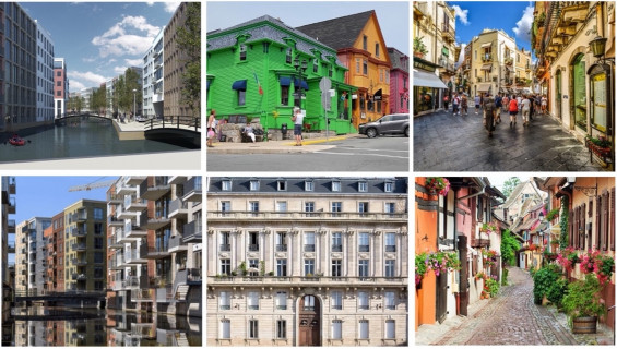
Variation creates liveliness and will extend the time visitors spend on a street. This principle is applied almost everywhere in the world. Walls are fitted with arches, pillars, porches, porches, pitched roofs, windowsills, canopies, balustrades, cornices, dormer windows, linear and vertical elements, see the bottom-centre image of a Paris’ building. At the same time, the attributes of separate buildings that provide variety are most effective against a coherent background. The Parisian avenues illustrate this too, because most edifices are built according to the same principles while the ornamentation of each facade differs. The attractive streetscape in Sicily (top right) and in the Alsace (bottom right) demonstrate an almost perfect balance between similarity and difference.
Use of colour
A good example are the painted houses in the Canadian settlement of Lunenburg, which was founded in the 18th century by German woodworkers and is a UNESCO world heritage site today (top centre). The nature of the construction and the type of buildings ensure cohesion; the colour provides the variation.
Street pattern
A manageable pattern of similarly important streets contributes to the spread of visitors and provides a level playing field for shops and restaurants. A mesh, which does not necessarily have to be rectangular, facilitates orientation. A rectangular street pattern is at the expense of the element of surprise and detracts from the feeling that there is something to discover. Squares will often be found at street intersections.
Landmarks
Understanding of the pattern of the streets is reinforced by providing intersections with landmarks, such as statues, fountains, or distinguishing buildings (photo, top right). These elements help visitors developing a mental map. Maps every here and there are more helpful than signposts. The fewer poles in the ground, the better.
Canals and moats
Canals and moats also contribute to the attractivity of the streetscape. They restore the human dimension in too wide streets, also in new parts of the city. The images on the left show a central street in Zaandam (top) and a 'waterway' in the Amsterdam Houthavens quarter (bottom). The edges of waterways should never be used as parking spaces. Definitely not in Amsterdam, because its unique streetscape.


